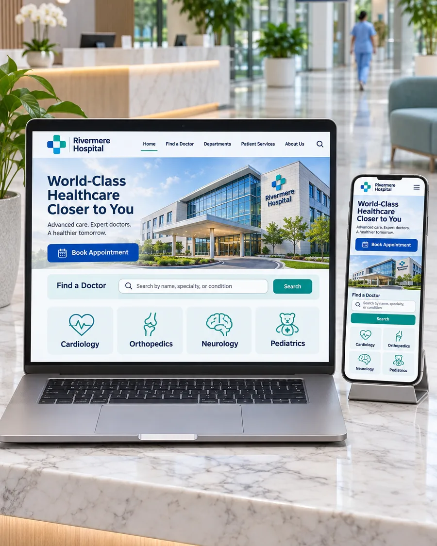

A hospital website has one job above all others: help a worried person find the right care and take the next step. Patients rarely arrive to admire the design. They arrive with a question, often on a phone, often in a hurry. Good hospital website design gets out of their way.
These are the features we see making the biggest difference, from single-specialty centers to multi-specialty hospitals.
1. A clear answer within seconds
The home page should tell visitors who you are, where you are and what you treat, then point them to the most common next steps: find a doctor, book an appointment, call, or get directions. If a visitor has to read three paragraphs to learn which city you are in, they will leave.
2. One page for each department and treatment
Patients search for specific problems, such as “knee replacement in Pune” or “cataract surgery near me”. A single services page cannot answer all of them. Give each major department and treatment its own page that explains:
- Who it is for and when it is not the right choice
- What happens before, during and after treatment
- Which doctors provide it, and how to book
These pages are also what search engines and AI assistants read when they decide which hospital to recommend.
3. Doctor profiles that build trust
Many patients choose a doctor first and a hospital second. Every doctor profile should include a real photo, qualifications, registration details, specialties, languages, the treatments they provide and how to book with them. Short videos of doctors explaining common questions help patients feel they already know them.
4. Booking that takes less than a minute
Make the booking button easy to find on every page. Ask only for what you need, confirm by message, and offer a phone or WhatsApp option for patients who prefer to talk. Every extra field and every extra step loses people.
5. Designed for phones first
Most patients will visit on a phone. Test every page on a small screen: buttons large enough to tap, phone numbers that dial when tapped, and nothing that requires zooming or sideways scrolling.
6. Fast loading
Slow pages lose visitors and rank lower. Google’s Core Web Vitals explain what it measures: how quickly the main content loads, how quickly the page responds, and how stable the layout is while loading. Compress images, keep scripts lean and choose reliable hosting.
7. Accessible to every patient
Your patients include older adults and people with visual, hearing or motor impairments. Follow the Web Content Accessibility Guidelines: readable text sizes, strong color contrast, descriptive image text, captions on videos and a site that works with a keyboard alone.
8. Clear location and visiting information
Directions, parking, entrances, visiting hours, emergency contact details and accepted insurance or payment options answer questions that otherwise turn into phone calls. Keep your address and phone number exactly the same as on your Google Business Profile.
9. Trust signals patients can verify
Accreditations, genuine patient reviews, real photos of your facilities and doctors, and case examples with consent all help. Avoid stock photos that look nothing like your hospital, and never use claims you cannot support.
10. Content that answers real questions
Patient guides, preparation instructions, recovery advice and answers to common questions show expertise and bring in search traffic over time. Every medical page should show who wrote or reviewed it and when it was last reviewed.
11. Privacy built in
Forms collect personal health details, so treat them with care. Use secure connections, collect only what you need, explain how you use the information, and follow the privacy laws that apply where you practice. In the US, that includes HIPAA for protected health information.
12. Tracking that measures appointments
Measure the actions that matter: appointment requests, calls, WhatsApp messages and direction requests, broken down by page and source. That tells you which departments the website is helping and where visitors drop off.
A quick checklist
| Area | Ask yourself |
|---|---|
| First impression | Can a visitor tell what you treat and where you are in five seconds? |
| Treatments | Does each major treatment have its own clear page? |
| Doctors | Does every doctor have a complete profile with a photo? |
| Booking | Can someone book on a phone in under a minute? |
| Speed | Do pages load quickly on a mobile connection? |
| Trust | Are reviews, photos and credentials real and current? |
| Measurement | Do you know how many appointments the site produced last month? |
Where to start
For one example, see how we built a website with a page for each treatment as part of the NR Vision Eye Care launch. If your website is not bringing in appointments, explore our healthcare website development service, see how we work with hospitals, or book a free strategy call.
Keep reading
Related insights.
-
Aesthetic clinic marketing: what works and what is allowed
Aesthetic and cosmetic clinics compete in one of the most crowded corners of healthcare marketing. Clients compare clinics on Instagram, read every review and often...
-
Digital marketing for doctors in India: a practical guide
A few years ago, most patients in India found a doctor through family, a neighbor or the nearest hospital. They still ask family. But before they book, almost all of...
-
How to choose a healthcare marketing agency: 12 questions to ask
Most doctors and hospital leaders have a story about a marketing agency that promised a flood of patients and delivered a pile of reports instead. Healthcare...